Sections a merchandiser can actually drive
Building a Shopify theme for thirty markets means the theme editor is the product. What to expose, what to hard-code, and why the demo matters more than the code.

On a store running in more than thirty countries, the theme is not really the product. The theme editor is.
Local teams need to change a headline, swap a hero, reorder a block, turn a badge off for one market. If every one of those needs a developer, you do not have thirty storefronts, you have thirty tickets a week and a very tired team.
So the actual engineering question is not “how do I build this section”. It is how much of this section do I hand over, and to whom.
Get that wrong in either direction and it hurts.
Too little configuration
The section is hard-coded, it looks exactly like the design, and it ships fast. Then the first request arrives - “can this be two columns on this market” - and it is a code change. Then a text change. Then an image swap.
You become a content management system made of a human being.
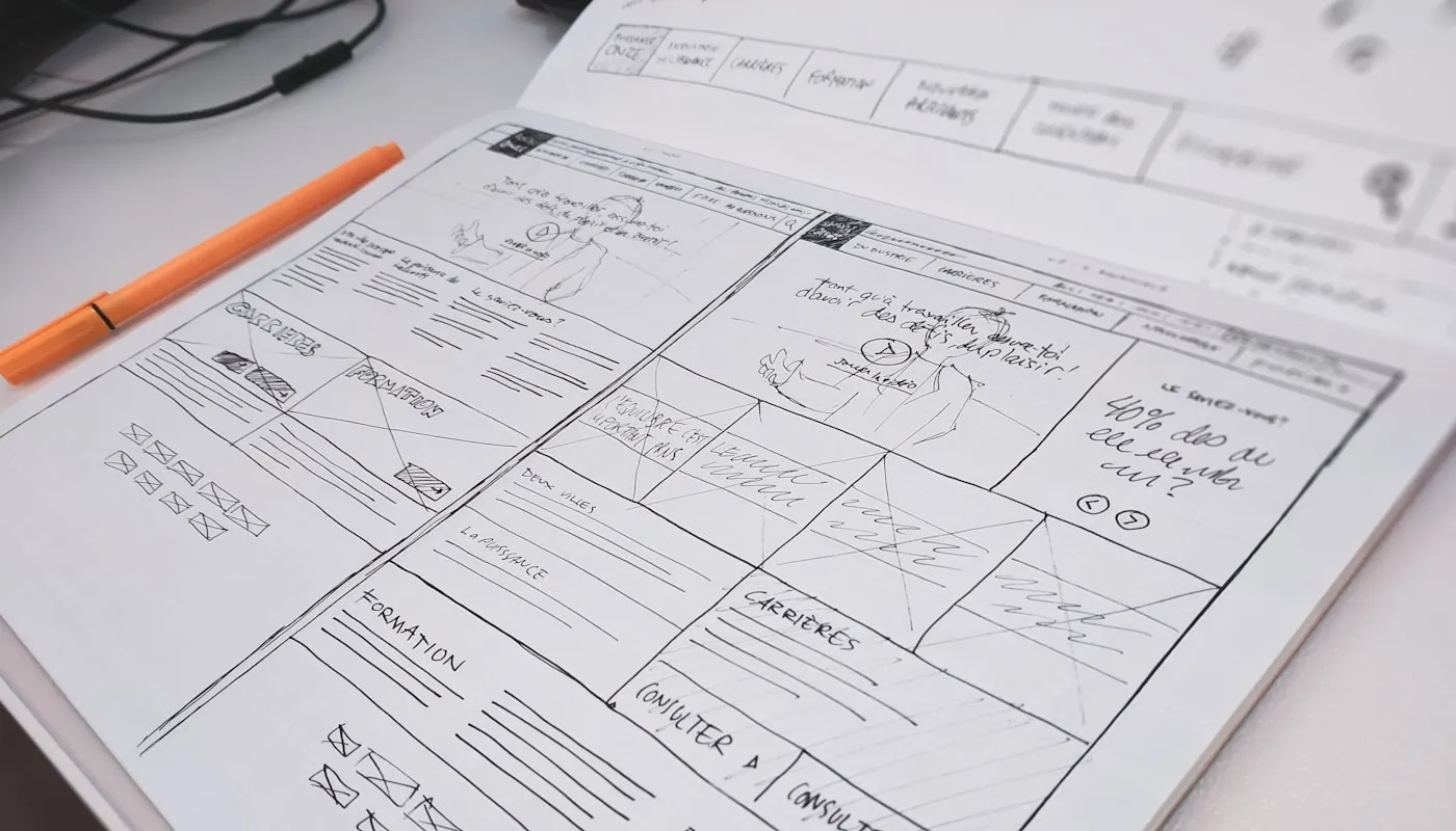
Every block on this sketch is a decision about who gets to change it later.
Too much configuration
The overcorrection is worse and I have done it. Every colour a setting, every spacing a setting, every element toggleable. It demos beautifully.
Then someone sets a white heading on a white background, or turns on three optional blocks that were never designed to coexist, and the page looks broken on a market you do not read the language of. Nobody did anything wrong. The system let them.
Configurability without guardrails just moves the bug from your code into someone else’s afternoon.
The line I use now
Expose content. Constrain presentation.
Text, images, links, order, on/off - hand those over completely. That is the merchandiser’s job and they are better at it than I am.
Presentation gets choices, not values. Not a colour picker - a select with Light, Dark, Accent, each mapping to a combination that a designer already approved. Not a spacing input in pixels - Compact, Default, Roomy. Not an arbitrary column count - the layouts the section was actually designed for.
The merchandiser gets real control. They just cannot reach a state that looks broken, because the broken states are not in the list.
Two rules that come with it:
Every optional block must look right when it is absent. If the layout collapses when someone turns off the image, that is a bug in my section, not a mistake by them.
Defaults must be shippable. A section dropped in with nothing configured should look like the design. People will use it that way on a deadline.
Checkout is the same problem with less room
Checkout extensibility gives you far tighter constraints, and the instinct is to rebuild the flexibility you are used to. Resist it. The narrow surface is doing you a favour - a checkout with fewer configurable states is a checkout with fewer ways to lose an order. Expose the content the market needs and nothing else.
The demo is part of the build
The last step is not merging. It is sitting with the people who will use the section and showing them how to edit it - in the editor, live, changing things.
That session is where you find out that the setting you named Enable secondary CTA means nothing to anyone, that two options nobody understands should have been one, and that the thing they actually wanted to change is the one thing you hard-coded.
I have rewritten more sections after a fifteen-minute demo than after any code review. It is the cheapest feedback available and it happens after most teams consider the work done.
The same idea, one platform over
The store above sells in thirty countries. I did the equivalent work on a Shopify Plus brand where the pressure was different - not many markets, but a campaign calendar that never stopped, with merchandising teams in two timezones.
There the win was measured in interruptions. Every configurable section and snippet that shipped removed a category of request from the developer queue: seasonal banner swaps, changing which collection a row pulls from, turning a promotional strip on for a weekend. Work that developers were doing dropped away, and the merchandising team stopped scheduling around someone else’s availability.
Same principle, different scoreboard. In one case the constraint is markets, in the other it is time. Both are solved by handing over content and keeping presentation on rails.
Why it is worth it
A section that a merchandiser can drive gets used. A section only a developer can change gets a ticket, then a queue, then a workaround, and eventually a duplicate section built by someone in a hurry.
The measure of this work is not how flexible the theme is. It is how rarely anyone needs to ask you.