A site health dashboard executives actually open
An internal app showing real-time storefront health and the state of every third-party integration - built for people who will give it fifteen seconds.
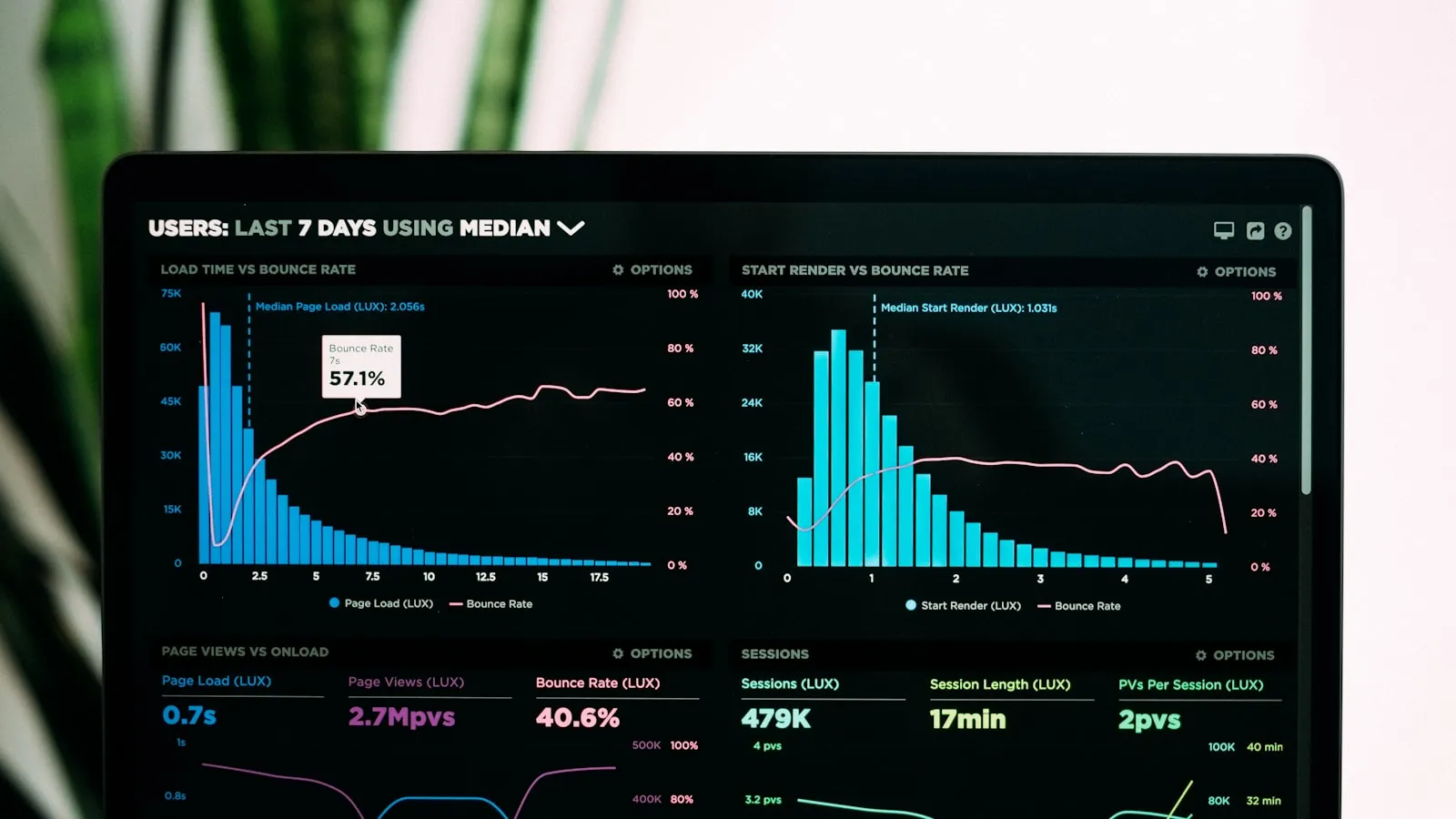
The request was straightforward: leadership wanted to know whether the site was healthy without asking a developer.
The trap in that request is that “healthy” means something different to everyone who says it. To a developer it means error rates and response times. To a merchandiser it means whether the campaign page is live. To an executive it means: are we losing money right now, and if so, who is fixing it.
Build the developer’s dashboard and nobody outside engineering opens it twice.
The fifteen-second rule
The constraint I designed against: this gets fifteen seconds of attention, possibly on a phone, possibly by someone walking into a meeting.
That kills most dashboard instincts. No grid of twelve sparklines. No metric that needs a baseline to interpret. If a number requires you to remember what it was last Tuesday, it does not belong on the first screen.
What survived was a single verdict at the top - fine, degraded, or broken - and underneath it, only the things that could have caused it.
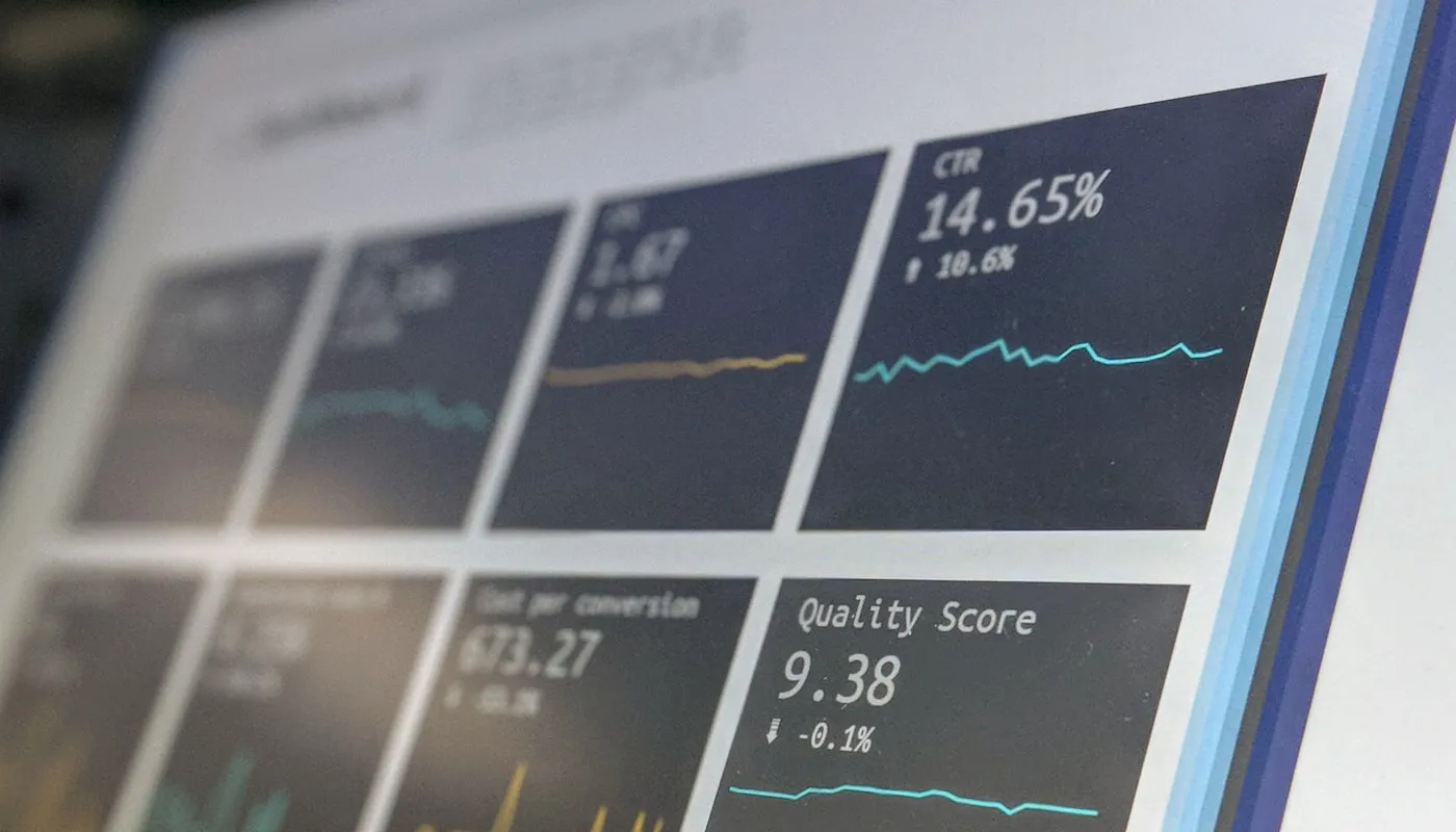
The dashboard engineers already had. Useful, and not the one leadership needed.
What went on it
Storefront performance, on a schedule. Core Web Vitals for the templates that matter, sampled continuously rather than measured once. The value is not the number, it is the shape over time. A gradual slide is the thing you want to catch; a single measurement can never show it.
Third-party integration status. This turned out to be the most-used part of the whole thing.
A modern storefront is not one system. There is the CDN and edge layer, the experimentation platform deciding which variant a customer sees, the search and discovery service returning product results. When any of those degrades, the storefront looks broken to a customer while every internal system says it is fine - because it is fine. It is just being let down by something it depends on.
Showing the state of each dependency, on the same screen as the site’s own health, changed the first question in the room from “what did we break” to “what is not answering”.
What changed recently. Deploys, theme publishes, campaign launches. Most incidents correlate with a change, and having the timeline next to the metrics answers the second question as fast as the first.
The parts I would do the same
One verdict, then detail. Everything is a drill-down from the single status at the top. Nobody has to assemble a conclusion from parts.
Names from the business, not the stack. Not the service’s product name - what it does. “Product search” rather than the vendor. The audience does not know the vendors and should not have to.
Say when the data is stale. A dashboard confidently displaying a five-minute-old number during an incident is worse than one that admits it is waiting. Trust is the entire product here; a dashboard nobody trusts is a tab nobody opens.
What it was really for
Not monitoring. There was already monitoring, and engineers already had alerts.
It was for shortening the distance between a customer having a bad time and the right person knowing about it - and for removing the meeting where four people speculate about whether something is wrong.
That is a communication problem with a technical solution, which describes most internal tools honestly.