Checkout extensibility: less rope, fewer ways to hang yourself
Moving checkout customisation from a Liquid file you could do anything in, to an extension surface that says no a lot. Why the smaller surface is the point.

For years, customising a Shopify checkout meant editing a Liquid template with no real constraints. You could inject a script, rewrite the markup, add a field, move a step. It was powerful in the way a chainsaw is powerful.
Then it went away, replaced by extensions: defined slots, an API surface, and a sandbox where your code does not have arbitrary access to the page.
The first reaction on every team I have been on was the same. We used to be able to do X, and now we cannot. That reaction is correct, and it is also the feature.
What the old freedom actually cost
The checkout is the one page where a mistake has a price you can put a number on. A theme bug costs you a bad-looking section. A checkout bug costs you the order.
With an unconstrained template, every customisation was a chance to break a payment method, an accessibility affordance, or a flow on a device nobody tested. And the failure was silent - nobody files a support ticket saying “I could not check out”, they just leave. You find out from a conversion chart a week later, if you find out at all.
The extension model removes most of those failure modes by removing the access that caused them. You cannot break the payment step, because you cannot reach it.
What you actually build
The work becomes narrower and much more specific:
Content in defined slots. A trust line under the payment button, a delivery note near the address, a market-specific legal sentence. This is most of it, honestly, and it covers most of what people ask for.
Fields you need to capture. A delivery instruction, a gift message, a required attribute for a market. The API gives you a place to put it and a place to read it back.
Rules with a real reason. Blocking a shipping method for a product type. Surfacing a message when the cart hits a condition. Business logic that used to be a script listening for DOM changes and hoping.
Branding, through settings. Not CSS you wrote. Settings the merchant controls.
Where it gets awkward
The honest parts.
You will be asked for something the surface does not expose, and the answer is no. Not “no, that is hard” - no. Building the muscle to say that early, with the reason, is more valuable than any workaround, because the workarounds in this area are exactly the things that break checkouts.
Testing takes deliberate effort. Extensions run in a sandbox; you cannot poke at them from the console the way you would a theme. Reproducing the state you care about - this market, this shipping method, this cart - is setup work every single time.
Upgrades are real. This is a platform surface that moves, and something you built against an early version will eventually need attention. Treat a checkout extension as maintained code, not shipped code.
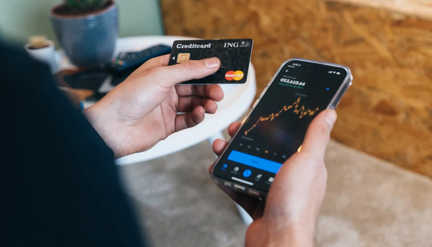
The one page where a mistake has a number attached to it.
The framing that made it easier
Stop thinking of the checkout as a page you own. It is a hosted flow you are allowed to place content into.
Once the team accepted that, the requests changed shape on their own. Instead of “can we redesign the checkout”, the question became “what does the customer need to know at this exact step” - which is the better question, has an answer inside the surface, and produces fewer arguments about what is possible.
The smaller surface did not just prevent bugs. It got everybody discussing the right thing.